Monday 2 May 2011

7) Looking back at your preliminary task – what do you feel you have learnt about it in the progression from it to the full product?

My finished copy of my preliminary task:


The technologies that I used for my preliminary where very limited compared to the ones I used for my music magazine. For my preliminary task, I only used Desktop Publishing and created and designed everything using that. My preliminary task was to make a school magazine and I based it on my school. I had to use original images and I designed it around my school colours. I used blue and white and included the school’s logo so that it gives it an identity and everyone knows what school the magazine is about. The colour scheme also works well with the school and creates a link between the magazine and the school. One of the main differences between my preliminary task and my music magazine is the amount of research that I was able to do for each task. I was able to do more research for my music magazine rather than my preliminary task. This enabled me to understand my audience better and therefore construct a much more focused production.  

The preliminary task was a quite simple to construct. Manipulating the images wasn’t difficult because all I had to do was crop and resize them, unlike my music magazine where I had to airbrush them and use all sorts of different buttons to manipulate the image. Desktop Publishing is quite a simple programme to use so it wasn’t difficult to make the magazine look realistic. Also, I didn’t get a lot of time to work on the preliminary task as much as I got for my music magazine. I also had to create a contents page for the preliminary task as well as one for the magazine. I had to do a double page spread for my music magazine, but wasn’t required to do one for my preliminary task.
The programmes that I had to use for my music magazine were really complicated compared to Desktop Publishing so I was at a disadvantage because I did not know how to use it well and couldn’t produce the work to a professional standard. 

I’ve feel that my magazine has progressed a lot more than my preliminary task. With my magazine I spent a lot more time thinking about codes and conventions and where things belong and what to kind of things I should include. With my preliminary task on the other hand, there wasn’t as much thought put into it. It was also a lot easier to take pictures for my preliminary task than for my music magazine and I didn’t need to take as much for my preliminary task  as I did for my music magazine. A lot of thought was put into the type of shots and the positions people had to stand for my music magazine whereas for my preliminary task I didn’t consider them as much. Also, the difference between my preliminary task and my music magazine is that I did not edit the pictures at all which gave it a more realistic school kind of magazine unlike my music magazine which editing the images gave it a more professional look.  


6) What have you learnt about technologies from the process of constructing this product?

The technologies that I used for my music magazine were Desktop Publishing, Serif PhotoPlusX4 and Picnik. I used these because they were the ones easiest available to me. I had access to Desktop Publishing at school and at home so it was easy for me to learn how to manipulate copy and images. Picnik is an editing software that you can have access to anywhere if you have the internet. This was really helpful because I had access to it both at school and at home. Because I have used Picnik before, I already knew how to manipulate the files and could use it relatively well. Another editing software that I used was Serif PhotoPlusX4. The problem with this was that I only had access to this software at school and because it was new to me I didn’t really understand and know how to use it well.

I conducted a lot of research into existing magazine products so that I could get a rough idea of what kind of magazines are already out there. I didn’t find a lot of magazines that were aimed at my demographic which was good for me because I could make the most of this space in the market. I used some ideas and conventions that other magazines had and developed them further for my magazine to give my magazine that little bit of edge. I found that a lot of the magazines were heavily edited to a professional standard and I tried to incorporate that and achieve that standard of editing.

I had to manipulate images to create different types of meanings and representations. The front cover was edited in many ways. I brightened the white of the eyes, removed any blemishes and lightened the picture as well as cropping it.  All of these were done so that is becomes more socially acceptable and attractive to the audience. The person in the image was also made to stand in a unusual position and follows the Male Gaze theory.

Here are the steps I went through to create the images used:


Airbrushing the images gives out the impression of perfection and it is something that the readers will want to achieve. Everyone is insecure about something and when they see the perfect celebrities on the front cover they will want to buy it because they will want to achieve that perfection themselves. The media industry makes a lot of money out of people because they use these technologies to create what is seen as an ‘ideal’ image or person and advertise it so that it becomes socially acceptable.

The backgrounds in the images used help create different meanings. The plain white background in the front cover was used because I found in my research that a lot of young girl magazines used a simple white plain background and I also used it to show and represent purity and innocence.  One of the images in my double pages spread was done with a homely background and included a bit of nature. I wanted to show how although this person has become known or is famous through her parent, she is still a down to earth kind of girl. The sky at the top was aligned with her head to show that she is trying to reach and aims high, that she has big dreams and thoughts. She wants to become known and successful, the quote ‘the sky is the limit’ fits in very well in with this point. The props that I used for this image was a violin because after all this is a music magazine and I am trying to represent her as someone very talented, especially musically.   

5) How did you attract/address your audience?


It wasn’t that hard to find a way to attract my demographic. Because they are young teenage girls they can easily be persuaded. I decided that in this issue the main thing I would offer them was a free lip gloss and a poster inside, since that was relatively popular. In other issues I would have offered a chance to win tickets to concerts. I think this would be a good idea for a magazine because it would be different and unique every week, not the same thing as they would get bored of it.
Because I was offering lip gloss, I would work with the company ‘Claire’s’, which is part of my audience profile, to help sell the magazine. It would create synergy between my company and theirs and because my target audience will identify the brand they will be more likely to buy it. Because I decided for my distributors to be IPC, I could work with their radio stations and get tickets available for concerts so that I could sell it in my magazine.

I could also use social media to help attract and address my audience. I could use websites that my demographic are most likely to go on and use, such as the Disney website and You tube and games websites. I could also use Facebook and create a like page since the internet is very powerful and can have a big influence in how successful my company will be. I will try my best to make my audience feel that they are part of the magazine and as if they can relate to any of the articles in there. My magazine will include things that are aimed at them, and about them so that my target audience will understand and will be able to relate to the magazine.
I will try to make it as entertaining as possible and include lots of copy and images so that my target audience will not get bored and lose interest in the magazine. I decided that by including quizzes and horoscopes in my magazine it will make it better and more likely to be bought by my audience because it offers something different and unique and something fun for them to do. Most people will throw away magazines once they finish reading them but hopefully with mine, they can keep them or at least last longer because of the other fun things to do that are included in the magazine.

I have decided that I will use as many buzz words in my magazine as possible. Because my audience are quite young they are more likely to use these words themselves therefore they will be able to relate to the magazine more easily. They are less likely to buy a grown up, intellectual magazine such as ‘Little White Lies’ because they can’t relate to it therefore it won’t appeal to them. An example of some of the buzz words that I included are, ‘World Exclusive’ and ‘Reveals’. These help attract my audience and get their interest into what information will be included in the magazine without giving too much away.  
The people featured in my magazine need to be someone my audience aspires to be or someone they can identify with. This is known as personal identification. When doing my research the majority said they would like to see a female singer on the front cover. This is because a female singer would appeal more too both genders and young girls would look up to them and see them as role models and someone they would love to be themselves.

The uses and gratification theory can be applied here. This theory focuses on the consumer and what the audience can get out of the media and suggests that the audience are not passive in this and are fully aware of the type of exchange that is going on.

The uses and gratification theory is mainly about what the consumers get out of the media. They use the media for many different things whether it is for passing the time by, getting information from the news, finding out information about soaps so that you have knowledge and can apply it to social interactions and interacting with distant family members or friends on social networking sites.

Maslow’s hierarchy of needs can also be applied here. The needs have been split into 5 categories, Physiological, Safety and Security, Love and Belonging, Esteem and Self-actualization. 
My demographic will fulfil their physiological needs because they will want their presence felt, they will want to feel like they exist, and they do this by using the media to create their own social networking profiles. They fulfil their safety and security needs by maintaining stability and following what everyone else is doing or using so that they can feel in control and secure about themselves. They have the choice of the kinds of media products that they can use and therefore feel safe and reassured by this. They fulfil their social needs, such as love and belonging because they get a chance to connect with friends and family through the media. They engage with conversations on social networking sites and the people that share the same views as them which will help them feel like they belong and are loved. They fulfil their self-esteem by voicing their opinions and engaging in conversations and showing off their images on social networking sites. They eventually get personal fulfilment and self actualization. 

Katz, Gurevitch and Haas (1973) developed their own hierarchy of needs in terms of social media. They developed a total of 35 needs and placed them into five different categories, Cognitive needs, affective needs, personal integrative, social integrative needs and tension release needs. My demographic will fulfil their cognitive needs by getting information and news out of my magazines, news that will help them out socially because they will be aware of the latest news and have knowledge so that they can use it in conversations. My demographic will fulfil their affective needs by gaining emotional pleasure from reading the articles there, especially if the young girls are reading articles like ‘How to get the man of your dreams’. They fulfil their personal integrative needs by achieving a status among their friends because they have knowledge others don’t. They fulfil their social integrative needs by being able to use the media to communicate with friends and family. They fulfil their tension release needs by using the magazine and the articles in there to escape from reality.

My audience have been encouraged to take part in the magazine in various different ways including them taking part in the magazine themselves. Sending in questions are emails so that they can be mentioned in the magazine covers this. I also thought of having a section where the audience can send in pictures of look-a-likes and this will help get them more involved in the magazine. Also writing in for the chance to win tickets is also another form of getting them to be a part of the magazine. Another simpler way of getting them involved in my magazine would be using the quizzes and games at the back of the magazine because they will answer it and take part which will help them feel more of a part of the magazine. 


I wanted the overall tone of my magazine to be like a best friend. I achieved this by using different forms of mode of address. One way of doing this was by including close up shots which gives a personal and intimate feel and allows the audience to feel closer to the people in the magazine. I included life style elements and the kind of things best friends would talk about in the magazine to help the audience feel more connected and have something to talk about. I have included love life elements and gossip columns because they are the type of things best friends would talk about. 

4) Who would be the audience for your media product?

For me to even begin on working on my music magazine I had to make an audience profile. 
My target audience are young teenage girls mainly aged 11 -16. The type of girls that love shopping in shops like ‘Claire’s’ for example, and I can use this to my advantage by working together with them to  advertise the products used and my magazine so that it creates synergy.
The audience for my profile will be people that enjoy pop music and are mainly interested in pop music but my magazine will include a bit of R&B and other genres to make it more interesting and appeal to a wider demographic. Because my magazine will be based mainly on pop music and the genre will be pop music, those are the main things that I will include on it.  
People that use the latest technologies and phones such as Blackberry’s or Iphones will also be included in my audience profile. Almost everybody has a phone and many have the latest Smartphone’s that have web2.0 and access to the latest apps. I can use this to my advantage by offering free downloads or apps or something for those phones so that it increases the chance of my audience buying my magazine.
I’ve also included bands and artists such as the ‘Jonas Brothers’, ‘The Saturdays’, ‘Justin Bieber’ and ‘Miley Cyrus’ because they are the kind of artist that will appeal to my demographic. Using them on my magazine will immediately attract their fans and increase the popularity of my magazine.
My audience will also be people that have access to the internet and laptops and computers. Almost every home in England has access to the internet of some sort so it would be very helpful to have a website for my magazine and for it to be available online, since the internet is becoming very powerful and a lot of people spend more time on the internet than anything else.
I will also use YouTube because it is something my demographic uses a lot and that’s where most of them get access to the music they listen to, according to my research. YouTube gets over millions of views a day so advertising my magazine on there would increase the general public’s aware of the magazine and attract many people in my demographic. This is also another form of synergy and will benefit my magazine.
The reason I put a picture of change and of coins is because my target audience are expected to not have a lot of money and notes in their pockets, instead they’ll have lose change from sweets and drinks that they buy at the newsagents with their magazines. 
I’ve also included an image of sweets as part of my audience profile because the people that spend their money on sweets are the ones that will spend money on my magazine. That product is something that appeals to them and it’s something that they will spend their money on.
I’ve also included an image of tickets. One of the things that I will offer in my magazine is the chance for people to win tickets to concerts. When I did my research I found that something like that was very popular and many would spend a lot of money and time and effort to see their favourite artists perform live.
I also included an image of Disney because it is something that my demographic listens and watches and is very popular among the younger generation. It is what most of my demographic aspire to be and look up to as role models. Disney makes a lot of money out of their music because the demographic are least likely to download illegally and would spend money on their CDs and their products. 

I did my own research to find information about my demographic and to create my own personal audience profile. I used qualitative and quantitative data to help me get a better understand of what my audience want and who my audience will actually be. I used both primary and secondary research. I conducted my own primary research by using questionnaires through the internet and in person. The questionnaires helped give me a better understanding of what kind of things to include in my magazine and what worked well in my magazine. I found some secondary research that shows what children aged 5 – 14 spend their time doing on the internet. The majority of these children spend their time on educational activities and playing online games. Almost half (47.1%) use the internet to listen or download music. This is good for me as I now know that if I advertise my magazine on the internet and on music websites, nearly 50% of my target audience will be likely to see it. This was helpful for me because it gave me a rough understanding of the kind of things the people likely to want to buy my magazine spend on. All of the information and the findings that I found helped me to understand my audience better and helped me improve my knowledge of how to create a magazine for them. 


3) What kind of media institution might distribute your media product?

There are three different options that I can choose to distribute my music magazine. These can be using an existing big publishing company, such as IPC or EMAP, or smaller independent publishing companies such as Development Hell Ltd, or also self publishing.

One of the media institutions that will be able to distribute my music magazine is IPC. IPC was first founded in 1963 and already produces over 60 iconic media brands and focuses on three core audiences, men, mass market and upmarket women. Some of the magazines they distribute for men include, ‘Country Life’, ‘Horse & Hound’, ‘Rugby World’, ‘Decanter’, ‘Nuts’, ‘Mousebreaker’ and ‘NME’. Some of the magazines they distribute for mass market women include, ‘Look’, ‘Now’, ‘Chat’, ‘Woman’, ‘What’s on TV’, ‘TV Times’ and ‘TV & Satellite Week’. Some of the magazines they distribute for upmarket women include, ‘Marie Claire’, ‘InStyle’, ‘Woman&Home’, ‘Essentials’, ‘Ideal Home’, ‘Livingetc’ and ‘Housetohome’.
Another large media institution that could distribute my music magazine is EMAP. EMAP is a British media company specialising in the production and distribution of magazines. It is the second largest distributor in the UK, behind IPC. It was first formed as a regional newspaper group in 1947.

Another option that I considered was Bauer Media as a distributor for my music magazine. It is Europe’s largest privately owned publishing group and offers over 300 magazines in 15 different countries, as well as online, TV and Radio stations.  Some of the magazines they distribute are, ‘Heat’ which is also a radio station and available online, as well as ‘Q’ and ‘Kerrang!’; ‘Closer’, ‘GRAZIA’, ‘more!’, ‘Pop’, ‘cocosa’, ‘Yours’, ‘Empire’ and ‘Mojo’. The problem with using Bauer as a publisher is that there is too much internal competition as they already sell a lot of magazines. The good thing about it though is that it has a good reputation and many contacts which would be good for my magazine.


Development Hell Ltd was an independent media company that I considered. It’s based in Islington, London and was founded in 2004 so it’s a new company. It was set up by two former EMAP executives, David Hepworth and Jerry Perkins. It currently publishes two monthly magazines, ‘The Word’ and ‘mixmag’ and distributes all over the country. The good thing about using this company as my publisher would be that they don’t have a lot of internal competition but because the executives have had experience in music magazines such as ‘Q’, ‘Empire’, ‘Mojo’ and ‘Heat’. Development Hell would be ideal because it is aimed at a niche market and so is my magazine.

I could also go into self publishing and publish the magazine myself. I will not have to rely on publishing companies and pay for them to distribute my magazine. With self publishing, it allows me the chance to have complete control of my magazine and it will not cost a lot for me to do it myself. A downside to self publishing is that I will not have an editor or someone to help correct errors and obvious mistakes in my magazine. 

Overall I’ve decided that IPC would be best suited for my music magazine because they are largest media institution and have a good reputation and background. They do not distribute magazines such as mine so there won’t be any competition internally. They have a lot of experience so they will have many contacts which are good for me. Because of their experience they will know what sells well and how to distribute it. My magazines is aimed at a large demographic so I think that IPC will be best at distributing it because it is so big itself, whereas a small independent company wouldn’t have the resources to achieve this.

I also thought about how I would market my music magazine. Some of the ways I can do this is by using and creating synergy between different companies. I will use the internet as one of the ways I could market my magazine because it is the best option and I can make the most out of it. It is a free way of advertising and marketing my magazine and reaches out to millions of people around the world. I will use synergy by creating a website for my music magazine as well as a real copy for people to buy in shops. I will include the web address in my magazines so that people can go on the website and give information of where people can purchase these magazines on the website. I will also use Web2.0 and social media to help market my magazine. I will create a Facebook page and a Twitters account so that people will be able to interact on the web. My demographic are most likely to use Facebook and Twitter so it is good because I will be able to reach my audience. I will give people opportunities to upload their own videos or thoughts on the website which will help the audience interact and get more involved with my magazine. I will give my audience opportunities to win things for their mobile phones and work with popular phones such as Iphones and Blackberries to create apps for them to use.  

2) How does your media product represent particular social groups?

Because I chose my demographic to be young teenage girls, I had to follow certain rules and stereotypes so that my music magazine appeals to my demographic. The person I choose to put on the front cover was chosen because when I did my research I found that the people that completed my questionnaire, the majority preferred a female singer on the front cover rather than a male or band. I chose someone young and playful so that it reflects my demographic and appeals to them. Children would want to see something or someone they can aspire to be on the front cover.
In class we conducted an experiment where we had 6 images of women, 3 were air brushed and 3 were normal. We then asked a group of young girls to put in order what they thought was the most attractive and what image they liked the best. They all placed the airbrushed images first and said what they liked about the image, whereas the normal images they said the women were not attractive and that some looked like they were drunk or on drugs. This is why I have chosen to airbrush my images, because they are seen as attractive and socially acceptable in society today.

My demographic will be girls aged 11 – 16. They are typical teenage girls that have just entered adolescence and care about their friends, love interests, TV shows and celebrity crushes. My magazine will be target them because there could be a lot of money made out of them. The music industry could also make a lot of money out of them as they are less likely to download illegally and would want to spend money to go see their favourite artists in concert. 
The clothing worn by the female on the front cover was chosen because it’s something my demographic would wear and the flowery top is quite girly and playful. The denim is seen as very youthful clothing and represents the youth itself. The long curly hair also represents the whole girly childlike look and is seen as very playful and innocent. If it was a more sophisticated and intelligent magazine she would wear her hair up in a high bun. My mode of address represents my readers in the fact that the words used in my magazine are the way my readers talk, the clothes worn are the kind of clothes the readers would wear, the things mentioned and talked about in the magazine are what represents my audience.

Girl magazine are stereotyped to be bright colourful and pink, and my magazine follows this stereotype to a certain extent. I did some research and found that with young girl magazines the majority had layers and layers of copy and images. I’ve tried to include that in my magazine.
The girl on the front cover would be seen as an archetype, someone that’s good and a recognisable character. It represents my demographic and they will be more likely to buy it because it represents them and are more likely to see their selves like that and want to be like that. 

The images that I have used are consistent with the Male Gaze theory. The Male Gaze Theory was developed by Laura Mulvey and she was influenced by the works of Sigmund Freud. Mulvey argues that classic Hollywood films and movies used and presented women as a visual pleasure to men. The audience was expected to be men therefore they are the ones that they should appeal to, identify with, admire and aspire to be.  She implied that women are shown on screen in order to provide men with visual pleasure and have an ‘erotic impact’. Women were made to look childlike and placed in positions that make men think they are more powerful and superior. A lot of media images are edited and photo shopped because that is what the audience finds more appealing.

My demographic are young teenage girls; they are most influenced by the media and easily represented. They see photo shopped images all around them and think it a norm. They aspire to be the ‘beautiful’ women in magazines and TV that they see.
I have used images that follow the concept of the male gaze in my magazine and used them to represent particular social groups. This image follows the concept of the male gaze as it has been edited so that it seems more appealing to my audience and she is playing with her hair which is very childlike and follows the male gaze theory as it makes the reader or audience feel more at power. She is standing in an unnatural and recumbent position which is one of the examples of following the male gaze. The camera is also looking down on her which gives her a lower status and makes her more vulnerable. She is looking directly at the camera which creates a mode of address and makes the readers feel she is looking at them so they feel part of the magazine. 
Here is another example of an image that follows the male gaze. She has been edited to look more appealing and more interesting to look out. The background has been kept to give it a more real life feeling to it and make it look more 3D and not so flat and boring. This is good because this is the kind of thing that my audience will want to see and she is presenting that particular social group by the clothes she is wearing and the fact that she has a musical instrument reinforces the idea that this is a music magazine and that she is representing the more intellectual music playing audience. 

I have chosen to use images that follow the Male Gaze because at the end of the day, that is what people want to see and what they find attractive in magazines, especially young girls. They find edited, photo shopped images more appealing because they are influenced by the media and taught to find it attractive and see it as a norm. It is the main reason why magazines do so well. It targets the primary audience, which is my chosen demographic, young teenage girls, as well as the secondary audience which are young males.  They both get something out of the magazine whether consumers buy it because they idolise the model or whether they buy it for visual pleasure. 


I used this image because it is a very stereotypical image of young males especially in the music industry. They have been made to dress and pose in a way which would make the audience identify with them because that is the way they dress and behave. Because they are familiar with this style they are more likely to buy the magazine because they can relate to it.
There are many different stereotypes of males in the music industry; one of them is the typical R&B Hip Hop and Pop look which includes wearing hoodies and hats usually at an angle. They would wear the hat at an angle to give it a bit of an edge; they are being risky and breaking the norm of wearing a hat the right way round. Most young males would look like this and wear these types of clothes so my target audience will be able to identify with them and find it appealing. This is the reason why I have chosen to include this type of image in my music magazine. 

I used this image because he represents a particular social group on his own. He is the kind of artist that has been brought to fame through Disney therefore he has to set an appropriate example for Disney’s target audience which are similar to my target audience. He is not the rock kind of artists or R&B and Hip Hop which is why he is not dressed in a stereotypical style that you would usually associate with Rock artists and R&B artists. He has been made to look more mature and intellectual but also at the same time young and carefree. He looks directly into the camera which engages the audience with him because they feel as if he is looking directly at them. He has also got his head slightly tilted to the side which is a childlike thing to do and gives him a sense of innocence and purity because of his white shirt. All this things help represent a particular social group.

Saturday 30 April 2011

1) In what ways does your media product use develop or challenge forms and conventions of real media products?

My media product is a music magazine which have been designed and targeted for young teenage girls. It is called Candy Music which was chosen because it is something they can understand and would appeal to them, many young teenage girls would be more likely to buy a music magazine if it was called ‘Candy’ rather than something like ‘Streetz’. The name of the magazine gives the connotations of something sweet and enjoyable which would appeal to my demographic.

To begin with I analysed two different music magazine front covers so that I could get an understanding of what the codes and conventions are and how I can begin to work on my magazine so that it looks like a real magazine. The first magazine that I analysed was NME.

There are some women that do buy this magazine but it is mainly aimed at men. 

I then analysed another magazine which I found online called ‘Rap-Up’.

Before I could even begin designing my magazine and creating it, I had to create templates for a front cover, contents page and a double page spread. Once I had done that I asked a few people to judge it and choose with ever one they like best.
Here are my templates for my magazine:


I then created a questionnaire and asked a few people to fill it out. Here is the questions that were asked:


Most of the feedback that I received showed that the most preferred template was the blue and pink one so I went with that. They said it stood out the most and the colours went well together. They said it was feminine but also not too feminine; it had a bit of a masculine edge to it because of the blue. They said it was good because it looked neatly organised and because of the columns, it easier to find what they’re looking for.
When asked if I should add any changes to the template the majority said that for the front cover, there needs to be more pictures and to limit the writing at the front. They said to include different shapes and make it more lively and playful. For the contents page, they said I might want to include something like a competition entry or a chance to win something.
When asked if the colour scheme appeals to them the majority said that the pink and blue go well together and are familiar colours for young girls therefore the girls will be able to relate to it and would find it attractive so that it increases the chance of them buying the magazine. They said it was eye catching and gave off a good vibe to the magazine.
When asked what else could be included in the magazine some of the suggestions were a chance to win something, games and quizzes, an agony aunt section, and exclusive interviews with celebrities to make the magazine more interesting and lively.
When asked if there was enough images or text and how it can be improved on the main thing they said was that it needs to be balanced out a bit more. Because it is aimed at young girls it wouldn’t be so bad to include more images than text.
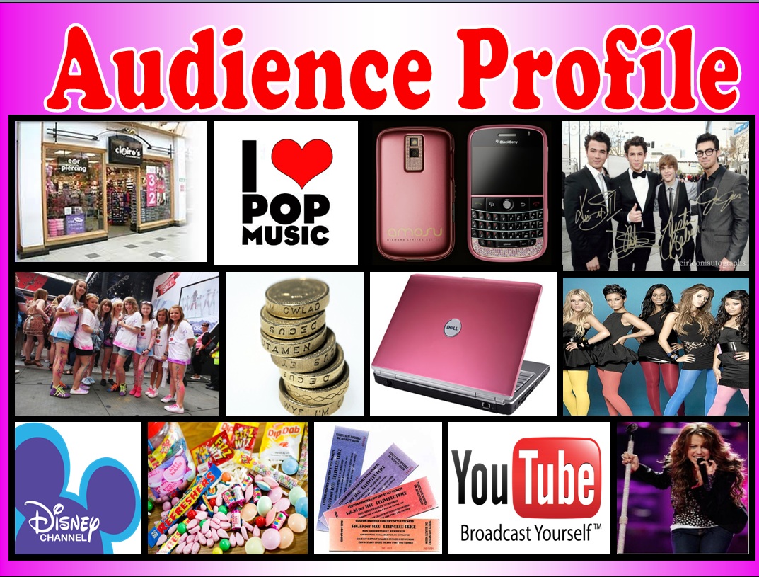
I used qualitative data to help me get a better detailed understanding of what my audience want and their thoughts so far on my magazine templates. I interviewed people that were aged 14-16 because they were easily available at the time and represented my demographic.


One of the ways I have followed the codes and conventions of music magazines by having a large bold masthead on the front cover. I have chosen to do it in pink because using the research I have collected and the secondary data, I know that, that choice of colour appeals to my demographic. I have also included a photo-shopped, edited picture on the front cover of the magazine. The main image overlaps the masthead which shows that the person is big enough and well known enough to be able to sell the magazine with just the image on its own.

There are many magazines that challenge the codes of conventions and one of the ways that I have challenged and broken the rules and conventions is by including the masthead centre right instead of centre left which most magazines do. I did this because I wanted my magazine to be different, unique and memorable.


I have included the price of the magazine on the front cover. Because my demographic is young teenage girls, the price has been made to stand out and appeal to them by using an earpiece. It has been made to look like an explosion so that it is very graphic and grabs reader’s attention, telling them to buy it and showing that there is important information here. Using that shape is a way of using semiotics to create meaning and understanding. The typography used for the masthead was called ‘You are loved’. It is clear and bold and gives the impression that it has been stamped on. When people think of the concept of stamps they know that it can be a collectable and so using that effect gives the readers the chance and idea to keep the magazine and keep buying them so that you can collect them. It also suggests that it is something special so therefore worth collecting and that it has been ‘officially’ stamped just for them.

The image on the front cover has been placed over a white background which gives the impression that it has been done in a professional photo-shoot. I have followed and used the stereotypical convention of putting the main image on top of the masthead. It has been edited using Serif Photoplus X4 and picnik so that it appeals to the reader and my demographic. The person in the image was made to look directly at the camera so that it gives the impression that it is maintaining eye contact with the reader and looking directly at them which will help them feel more involved in the magazine and as if they are a part of it. This is known as direct address.

I have included the bar code on the bottom left hand corner which is a common convention for magazines and the website of the magazine with it which shows synergy. Synergy involves two different things or companies working together, in this case, the magazine and the website working together to promote each other.  As well as having the bar code at the bottom of the magazine I have followed the norm by including the issue number of the magazine under the masthead.

I have followed the convention of using a banner at the top of the magazine and developed this by using a banner at the bottom of it as well as the top. I developed it further by using the banner to advertise the free poster and free lip gloss that would be available with the magazine. This will help increase the amount of magazines sold because my audience will notice that on the shelf and so it needs to be something that would appeal to them and keep their attention. I added an additional incentive, a ‘Free GAMOUR GIRL Lipgloss!!’ and a ‘Free Justin Bieber Poster Inside!’ so that it appeals to other consumers as well.

The colour scheme I have used has been based on what my research and findings suggested. The most popular colour scheme for the front cover was pink and blue; therefore I tried to incorporate that into the front cover and the contents page. Another popular colour choice was red so I incorporated that into the double page spread.
When you look at young girly magazines you usually find them packed with lots of information and games and they are made to look very bright and colourful. I have developed this further by using layering and cramming lots of cover stories and features especially around the main image which is really common in music magazines. Using the heart has also made my magazine more appealing to my demographic and it is very child like so they can relate to it.

I have also included many life style elements to my magazine because when I did my research I found that is what really appealed to my demographic and all the girl magazine that I saw online included many of these. My demographic will get bored of just hearing about the music and lose interest therefore I thought it will be better because the life style elements that I included will keep them interested and will appeal to consumers.


I also had to create a contents page for my magazine and had to follow different codes of conventions for it. But before I did this I analysed two contents pages so that I could get an understanding of what to do and how to begin.
The first contents page that I analysed was from the magazine NME: 
What’s also interesting about this contents page is that NME has included a info box at the bottom left corner where they are offering something. They are trying to get readers to subscribe by offering them a chance to save money. This is a good idea because it appeals to their own demographic but maybe not for me as saving money will not be such a big issue to young teenage girls. They also used synergy here by telling the readers to go to a website or calling them for a chance at saving £45. And, teenage girls are less likely to subscribe as it usually involves using a credit card which they will not have access to themselves.  

Another magazine contents page that I analysed was from VIBE. One of the things that I found very interesting about this magazine was the way the model crosses her leg to make the letter ‘V’. This is really effective as it reinforces brand identity in an interesting and unique way. The heels she wears show connations of class and power. The colour scheme works really well here, the use of black white and grey create elegance and a modern look which looks bold and interesting.


For my contents page in my magazine I had to try and make it so that it appeals to my demographic and one way I did this was by keeping the same colour scheme from my front cover and my contents page. This shows continuity and the readers will be familiar with the colour scheme and recognise it and links the two pages together.

The same font and typography was used for the title of the front cover and contents page and the same colour was used for it. I did this to help link the two pages together and reinforce the idea that this is still a very bright playful magazine for young girls. The background was ideally supposed to be all one colour, pink, but it didn’t look interesting enough and looked plain. I then decided to add a white strip to it which also helped give a divide between the pictures on the right hand corner and the cover stories and features on the left corner so that it was clear which is good because my audience are young and so this would help them understand it better.

The pictures were placed on the right hand corner and at an angle to show that it is playful and original and unique. I used a lot of different shapes in the magazine because out of the research that I did I found that a lot of the girl magazines had a lot of images and shapes in their magazine and I followed this convention. The playful hearts represent the youth and my target audience will recognise with them and can probably relate to them. It is something young and playful and makes the magazine more appealing and interesting to them.

The writing on the left has been placed in an organised way and in the right order because my audience is young they will find it easier to understand and it will be clear for them where to go if they want to read that particular article. I split the features and interviews in separate boxes so that it is easier to read and understand. I also followed the convention of placing a page number next to the image so that the readers know where to go if they want to read about that person. I followed my template as much as I could by including the title on the top left corner, images going down on the right hand side and included the interview and feature stories in boxes on the left.


I was also required to make a double page spread for my magazine. Before I could begin work on my double page spread I analysed a double page spread from NME.

 I used my template and this example of a double page spread from NME as a base to start on my own double page spread. I first edited the pictures to make them look more ‘attractive’ and stand out more. The backgrounds were kept white because the article was about the artist having a photo-shoot in the interview and it helps represent the artist as someone new and fresh to the music industry, therefore their life is a clean slate, white and ready to be filled with colour and writing.

I tried to include lots of images in my double page spread because when I did my research, a lot of people mentioned that they would like to see a lot more images. This is good because it will appeal to my demographic as they will like to see images. I included an interview in my double page spread because my audience will be more likely to read an interview instead of a long dull article. With an interview they will not lose focus or interest.
I decided to change the colour scheme to red and blue because that was the second most popular colour scheme that my volunteers picked out. I did this to have something different in the magazine so that it gives it a little bit of edge. A lot of magazines seem to do this as well. 

I used the same type of font and size for the title for the double page spread, this helps create a link between the other pages and creates an identity. Readers will see it and recognise that it belongs to ‘Candy Music’ magazine. I also placed it in between the two pages and on the picture so that it links the two together and acts like a bridge. 

The main image was made to look like its 3D and standing out. I thought this would be a really cool and fun and interesting way of displaying the image. The image has been used to follow the ‘Male Gaze’ theory because the camera looks down on her and she is seen playing with her hair. The clothing she is wearing helps represent youth.

I decided to add a new artist section below because I found that a lot of magazine’s seem to do this. It was made to look like a post-it-note, something the reader would feel like they can jot the artist down. You usually write something important on post-it-notes for you to remember and the reader will recognise this and feel that the artist mentioned is important enough to remember.

I followed the convention by making the first letter of the introduction section bigger than the rest. This is very common for many magazines as it grabs the reader’s attention and shows them where the article begins. I included a bubble with a quote from the interview in there as well so that it grabs the reader’s interest and gives them a little example and taster of what the article will be about.